Jericho Living/Kitchen & Dining
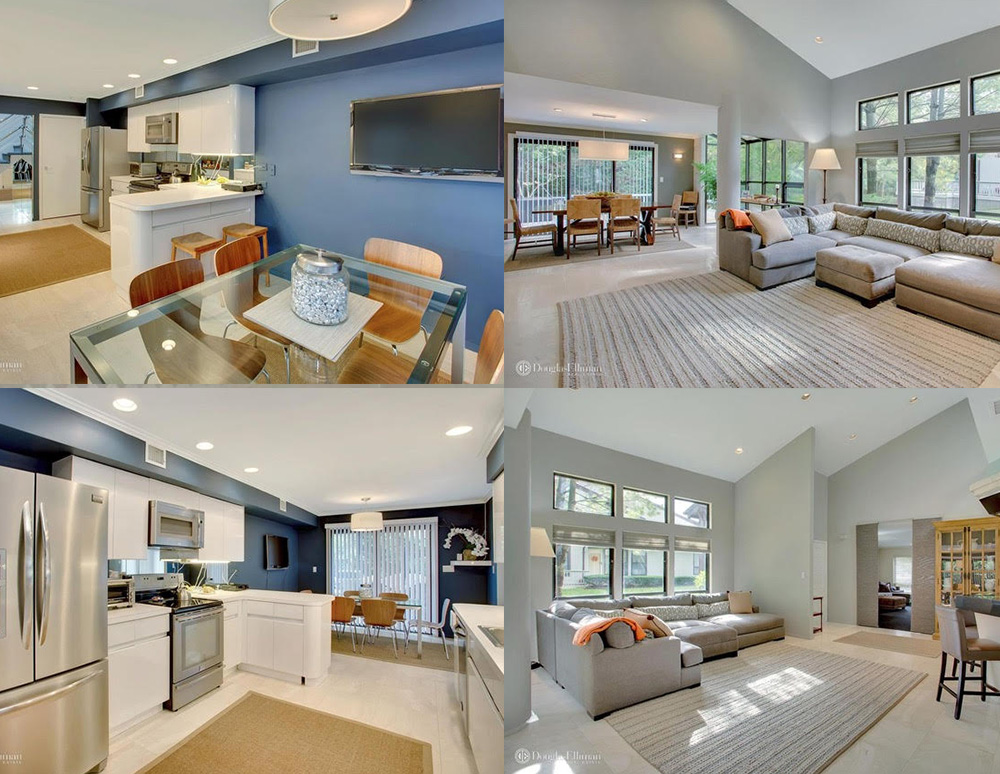
Problem & Objective
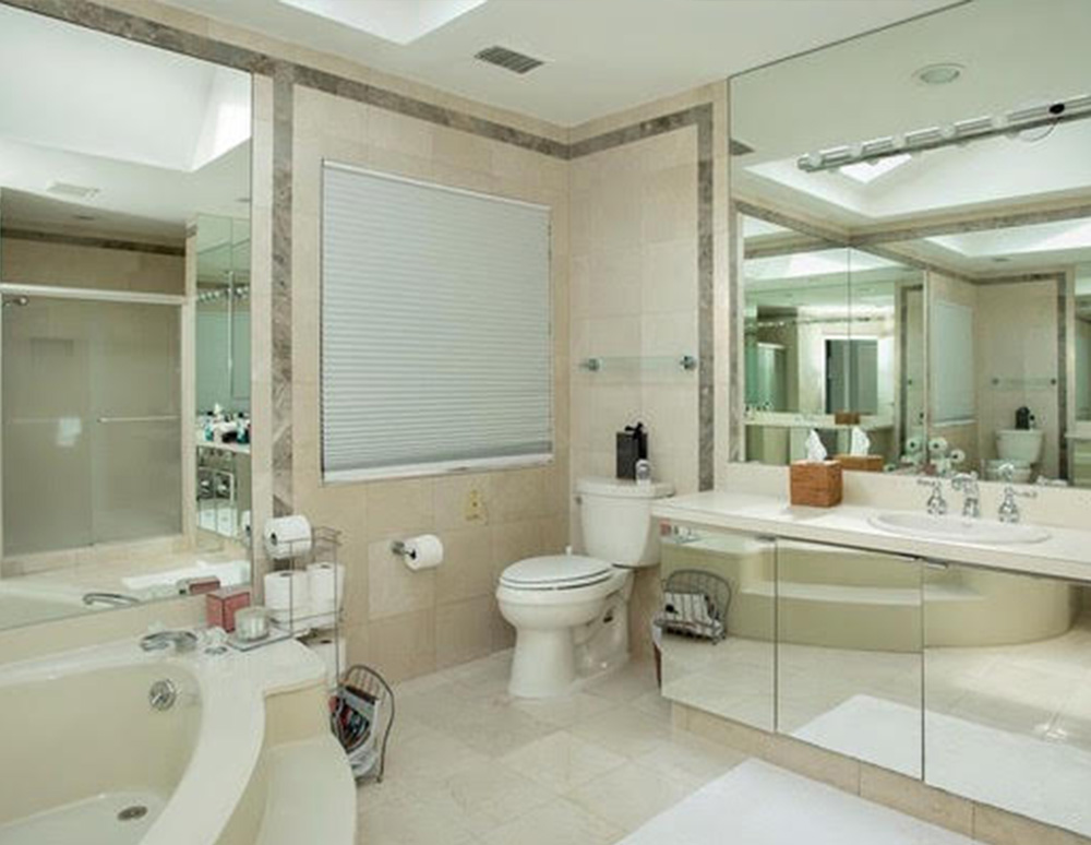
The challenge with the original master bathroom was that it was outdated, too small for storage, and could not accommodate a free standing tub like our client wanted. Taking a look at their current space, we thought to use part of the adjacent closet to enlarge the space and create a spa-like room for our client. We wanted to make sure that the updated master bathroom would be more tailored to their every day storage needs and take on a much more modern look, but still maintaining a zen experience. The furniture would also need to be carefully chosen so that the space will remain clean and uncluttered looking.
Solution
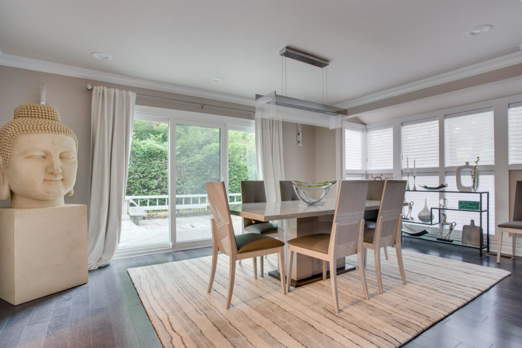
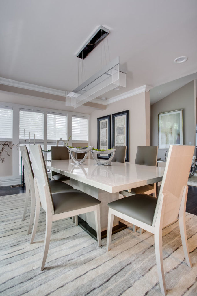
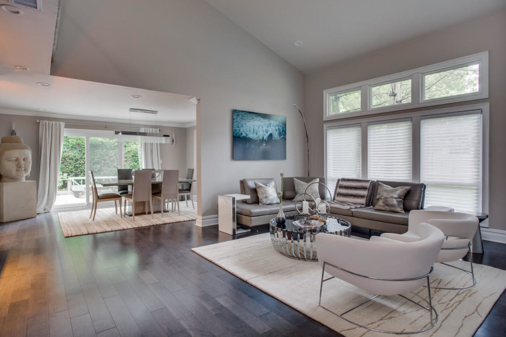
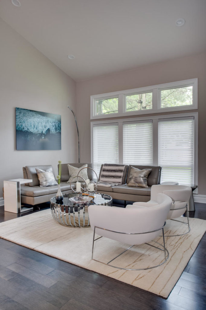
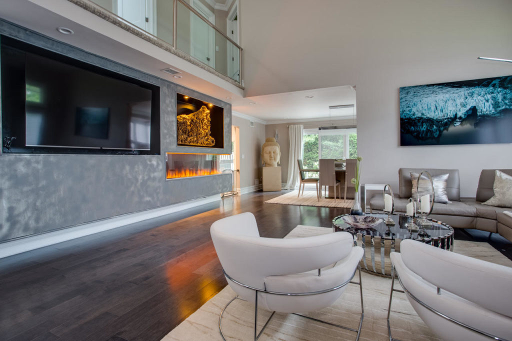
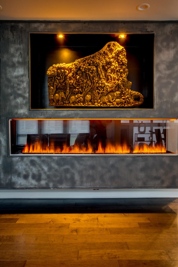
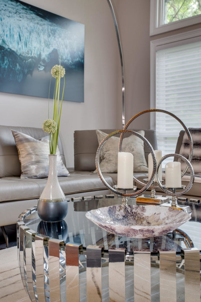
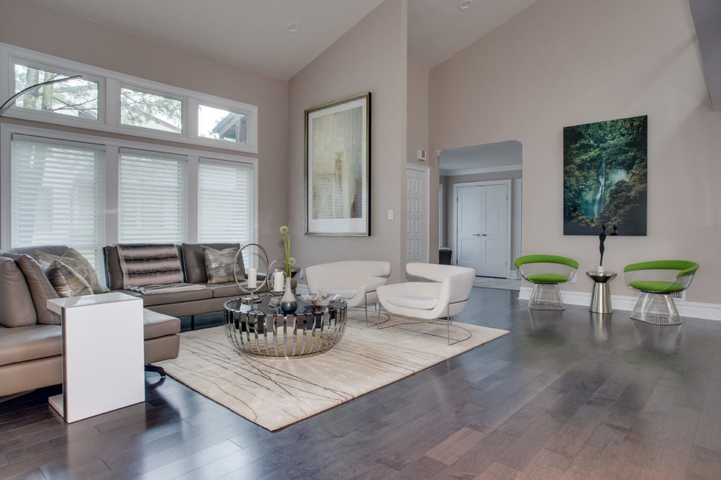
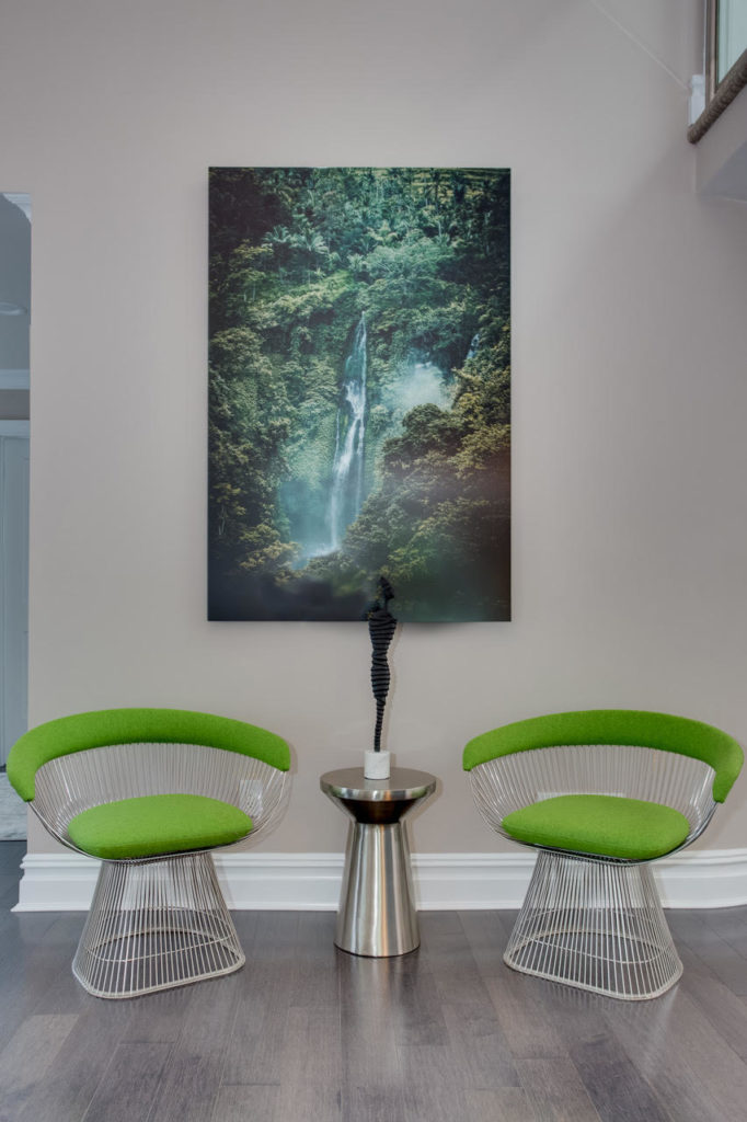
Before decorating the space, we took a look at all of the pieces she had in her collection to really understand how the whole room could be put together.Among her collection is a beautiful carving from Thailand, which is her favorite piece. We wanted to ensure it would become a focal point of the room. She also has a large Buddha sculpture that we used to display in the main entrance foyer so that it can be seen as soon as one walks into the house.From our consultation, we learned that our client wanted a calming and relaxing space where she could unwind after a busy day – so we focused on refined, minimalistic pieces and furniture throughout the space that used neutral colors, with a splash of green decorations all around.We were inspired by nature for this color palette, gathering tones of earthy and warm colors, to elevate that feeling of mindfulness and relaxation. She will continue to travel and expand her collection, so we left some room for the future masterpieces – so the interior will keep evolving!
Jericho Master Bathroom
Problem & Objective
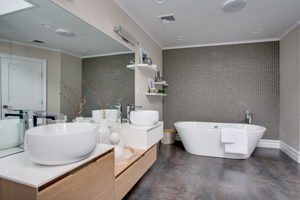
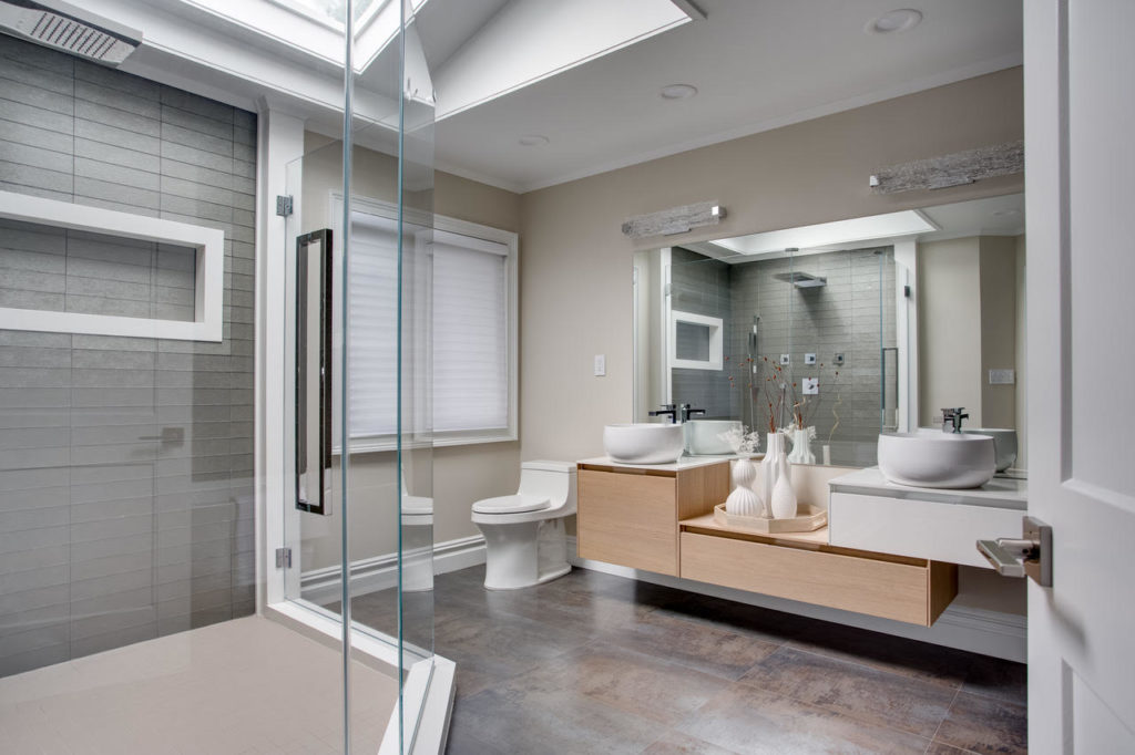
To really open up the master bathroom, we ensured that the space is flooded by natural light from a skylight located right above the shower. The glass doors allow for an expanded feel to the bathroom even with the addition of the free standing tub on the other end of the bathroom.
To bring in a sense of tranquility, we used a nature inspired palette of warm and earthy tones for the tiles. The accent wall, behind the tub on the far end, has a basket weave texture to create a matching harmonious and relaxing vibe.
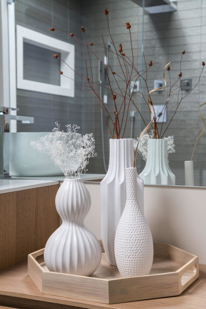
Incorporating the floating asymmetrical custom vanity feels light and airy despite of its large size in the center of the bathroom. We displayed more personal objects and photographs from our client’s travels on the counter space. White accessories tie all of these features together, such as these elegant, white textured vases.
According to her, this is her favorite room in the house!
Solution
Before decorating the space, we took a look at all of the pieces she had in her collection to really understand how the whole room could be put together.Among her collection is a beautiful carving from Thailand, which is her favorite piece. We wanted to ensure it would become a focal point of the room. She also has a large Buddha sculpture that we used to display in the main entrance foyer so that it can be seen as soon as one walks into the house.From our consultation, we learned that our client wanted a calming and relaxing space where she could unwind after a busy day – so we focused on refined, minimalistic pieces and furniture throughout the space that used neutral colors, with a splash of green decorations all around.We were inspired by nature for this color palette, gathering tones of earthy and warm colors, to elevate that feeling of mindfulness and relaxation. She will continue to travel and expand her collection, so we left some room for the future masterpieces – so the interior will keep evolving!
Jericho Guest Bathroom
Problem & Objective
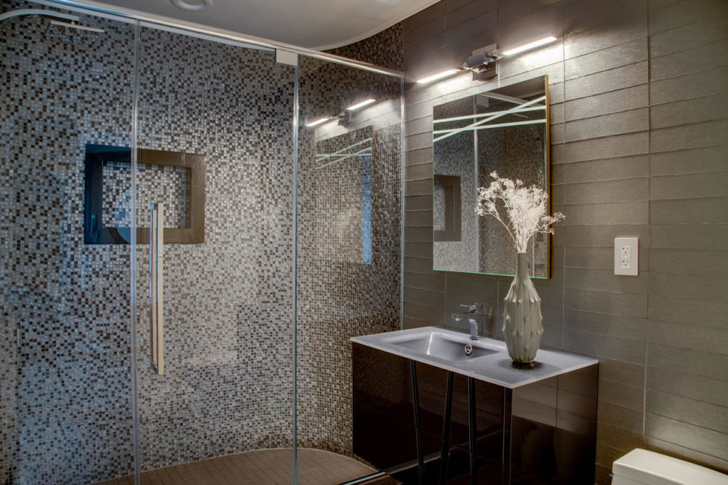
Guest bathrooms and powder rooms are the best spaces for some drama, which was a clear missed opportunity in this particular bathroom. The original space was clearly a tight fit but with some specific styling choices, we knew that we could transform it to make it look like it was expanded. The wall texture, sink, and mirror would all need to be swapped for an updated, modern bathroom.
Solution
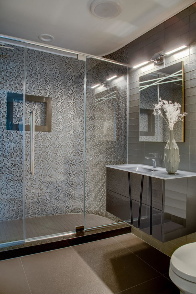
We used a floating vanity with a reflective surface to give some sparkle and glamour to the whole space. This new counter top space let us include a decorative vase that introduced a new, contrasting texture.
The color palette of the bathroom is much darker than the original, with different tones of grays and browns to juxtapose the lighter colors included throughout.
The frameless mirror was specifically chosen to tie together the clean, fresh look of the new guest bathroom instead of taking away too much attention from other features.
The new walk-in shower uses glass doors to maintain that expanded look and also showcases the intricate, glass mosaic shower tile design behind it that would otherwise be hidden.

